
THE ROW
You know when you were little and you saw a meteor for the first time? watching the Olsen twins hit it out of the park like this felt very similar. i usually love to see what crazy combos they wear on the red carpet, but i didn't realize what glorious vision they might proffer on the runway. from the gothic, plum lips and sleek middle parts, to the miles of fur* (i'll justify that later) to the leopard loafers, this will be my winter uniform. just remind me to put the dr. zhivago soundtrack on my ipod and i'll be set.let's get the obvious out of the way.

CARVEN
gorilla arms, circular shades, and the best gargoyle sweater of the season.
Well, that's basically it in a nutshell. Carven satisfied both my yearnings for awkward body shapes and allusions to medieval symbolism.

ETRO
combining color creatively--also, more gorilla arms.
There's something about Etro that's a little ugly but very appealing. we'll call this their Steve Buscemi collection. Colors definitely made new friends here; the azure blue with the saturated dirt brown, the coral with navy and cream, and finally that last dress that would have Rumpelstiltskin foaming at the mouth. I also love the choice of lamb's wool (or is it yarn? hah) in place of the Row's obvious fur choices. Makes the outfits a little less murdery.
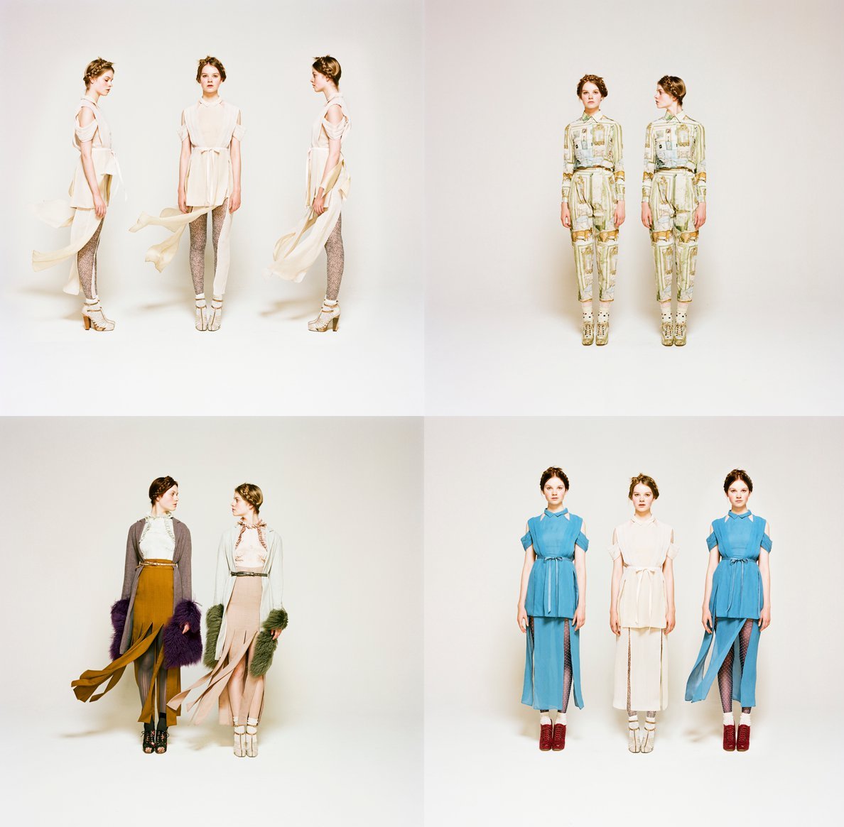
RODARTE FOR OPENING CEREMONY
1930s Prairie Chic meets unflattering baroque print pantsuits I would kill to own.
This collection reminded me a little of Faye Dunaway's portrayal of Bonnie Parker, but with less sex--and I mean that in a good way. The exposed legs and shoulders are more architectural than slutty and thus more interesting. I like that the Mulleavy sisters offered us a farm girl without the sickly sweetness and purity so often associated with the Simple Life. The key though, again, is the beautiful combinations of color. I own the look in the bottom left, but without the gorgeous mustard, lavender and olive my own look falls flat. Again we see the blue and brown found in Etro's fall collection, this time a little softer. It's an interesting palette for a fall collection; usually the colors are so saturated or dark we lose the airiness of winter, the softness of snow.

SUNO
prints!
Suno is always known for their prints, and I have little to add here. Noteworthy is the mix of prints and texture; combining plaid and floral is a dangerous endeavor. Still, Suno seems to perform with ease, and we're given some great ideas to feminize those wool capes and flannel shirts.

VENA CAVA
time to invest in some waterproof mascara.
Perhaps we'll end on a sour note, here, as Vena Cava's f/w 2011 collection was not well received. True, it was a little trashy, thanks in part to the stringy hair and hangover face. I'm willing to take a risk and say I liked the overall look. The metal collars are spot on (already found mine at a thrift) and I'm such a sucker for a column dress. I liked the 90s fabrics despite our current infatuation with the 70s I thought it still looked fresh. Perhaps there was just enough disco to sell me on it in the end.
i LOVE this post! You were so dead on w/choosing cohesive color, print and shape stories. My Fave: Rodarte for Opening Ceremony! You can't beat that deep sky blue dress w/ perfectly matching cranberry shoes!
ReplyDelete